ABOUT
Benefits Page – BTG Pactual
Bank BTG Pactual – 2025
There was no centralized benefits page, which made it difficult to clearly communicate the value delivered to employees. To address this gap, I designed a new page fully dedicated to benefits and partners, structured in a visual, scalable way and fully aligned with the design system.
The work involved benchmarking, creating reusable modules, and leveraging the existing design system to ensure consistency, flexibility, and adherence to the bank’s branding.
Introduction
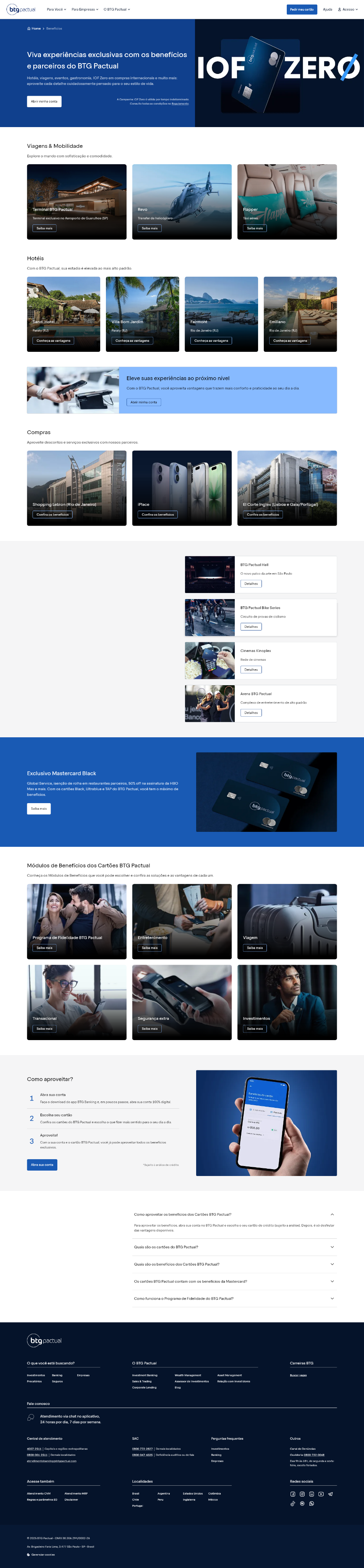
Before the restructuring, the bank did not have a single space that brought together all the benefits offered to customers. This information was scattered across different areas and documents, making access difficult, reducing clarity, and preventing proper valorization of the company’s differentiators.
Given this absence, I identified the need to create a dedicated page capable of gathering all the benefits in an organized, attractive, and strategic way. The intention was to offer a clear and dynamic environment that remained faithful to the bank’s visual identity.
Development
Since the benefits offering is volatile and frequently updated due to new partnerships, it was essential that the page be scalable and easy to maintain. This principle guided the entire creation process.
I began with a benchmark to understand how other companies in the sector presented their benefits. The focus was on finding visually strong references that communicated value and ease of reading, without sacrificing consistency with the bank’s positioning.
With this diagnosis, it became clear that the most suitable solution would be a modular approach. For this, I developed new modules within the existing design system, using components already available in the library. This decision ensured full alignment with the branding and enabled the creation of a visually appealing, flexible page with high expansion capacity.
The modules were designed to present each benefit in a clear and organized way, with visual prominence, simple categorization, and an information hierarchy that facilitated quick reading. The modularity also allows new benefits to be added or removed without compromising the overall structure of the page.
Final Result
The result was a complete benefits page, centralized and visually consistent with the bank’s identity. The modular structure ensures agile updates, avoiding rework whenever a new partnership is established or a benefit changes.
The delivery consolidated a space that highlights the value offered to stakeholders, communicates clearly what the bank offers, and creates a richer, more organized experience. In addition, adherence to the design system and branding strengthened the perception of professionalism and brand cohesion.
The new page not only solves a communication gap, but also becomes a strategic resource for attracting and retaining new leads, as well as facilitating content expansion as the bank grows.

Ana Saddi - Product Designer
© 2025 Todos os direitos reservados
ABOUT
Benefits Page – BTG Pactual
Bank BTG Pactual – 2025
There was no centralized benefits page, which made it difficult to clearly communicate the value delivered to employees. To address this gap, I designed a new page fully dedicated to benefits and partners, structured in a visual, scalable way and fully aligned with the design system.
The work involved benchmarking, creating reusable modules, and leveraging the existing design system to ensure consistency, flexibility, and adherence to the bank’s branding.
Introduction
Before the restructuring, the bank did not have a single space that brought together all the benefits offered to customers. This information was scattered across different areas and documents, making access difficult, reducing clarity, and preventing proper valorization of the company’s differentiators.
Given this absence, I identified the need to create a dedicated page capable of gathering all the benefits in an organized, attractive, and strategic way. The intention was to offer a clear and dynamic environment that remained faithful to the bank’s visual identity.
Development
Since the benefits offering is volatile and frequently updated due to new partnerships, it was essential that the page be scalable and easy to maintain. This principle guided the entire creation process.
I began with a benchmark to understand how other companies in the sector presented their benefits. The focus was on finding visually strong references that communicated value and ease of reading, without sacrificing consistency with the bank’s positioning.
With this diagnosis, it became clear that the most suitable solution would be a modular approach. For this, I developed new modules within the existing design system, using components already available in the library. This decision ensured full alignment with the branding and enabled the creation of a visually appealing, flexible page with high expansion capacity.
The modules were designed to present each benefit in a clear and organized way, with visual prominence, simple categorization, and an information hierarchy that facilitated quick reading. The modularity also allows new benefits to be added or removed without compromising the overall structure of the page.
Final Result
The result was a complete benefits page, centralized and visually consistent with the bank’s identity. The modular structure ensures agile updates, avoiding rework whenever a new partnership is established or a benefit changes.
The delivery consolidated a space that highlights the value offered to stakeholders, communicates clearly what the bank offers, and creates a richer, more organized experience. In addition, adherence to the design system and branding strengthened the perception of professionalism and brand cohesion.
The new page not only solves a communication gap, but also becomes a strategic resource for attracting and retaining new leads, as well as facilitating content expansion as the bank grows.
Ana Saddi - Product Designer
© 2025 All rights reserved