ABOUT
Mynt Homepage Revamp
Company: BTG Pactual Group
Launch: 2025
Role: UX/UI Designer
Collaborators: Business team, IT team, UX Research team, and Analytics team
Platform: Responsive Web
Overview
The Mynt homepage was outdated and no longer reflected the brand’s positioning or the experience offered in the app.
Although Mynt is a modern platform with strong use of motion and light, friendly communication in the app, its homepage failed to convey the same feeling, resulting in a disconnected experience between channels.
In addition, Mynt’s audience is mostly composed of beginners and people curious about the crypto universe, which reinforced the need for clearer, more fluid, and more intuitive communication from the very first interaction.
Process
Research
A benchmark was conducted with other players in the crypto market, identifying a pattern of more dynamic, modern, and motion-oriented pages.
The analysis highlighted a misalignment between Mynt’s digital experience in the app and its institutional page, reinforcing the need for a revamp focused on fluency and clarity.
UX Definitions & Decisions
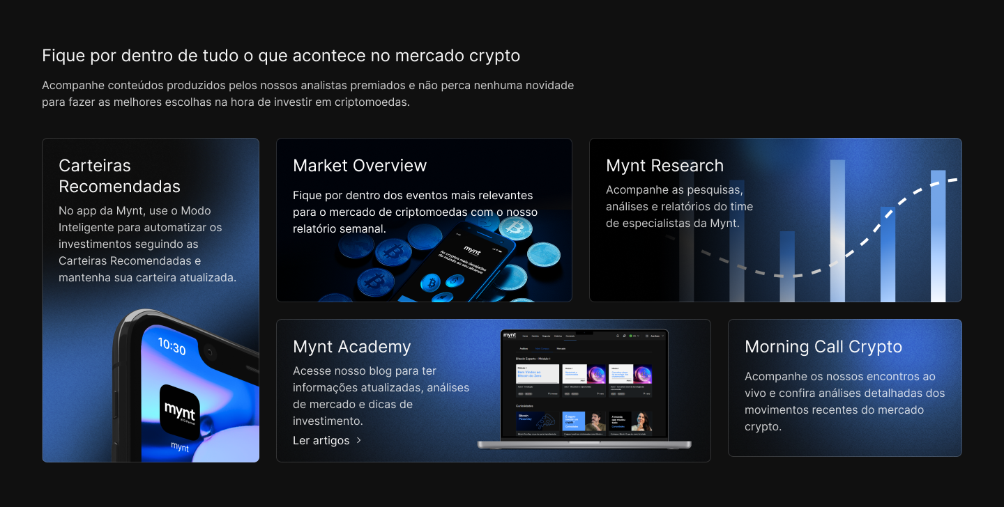
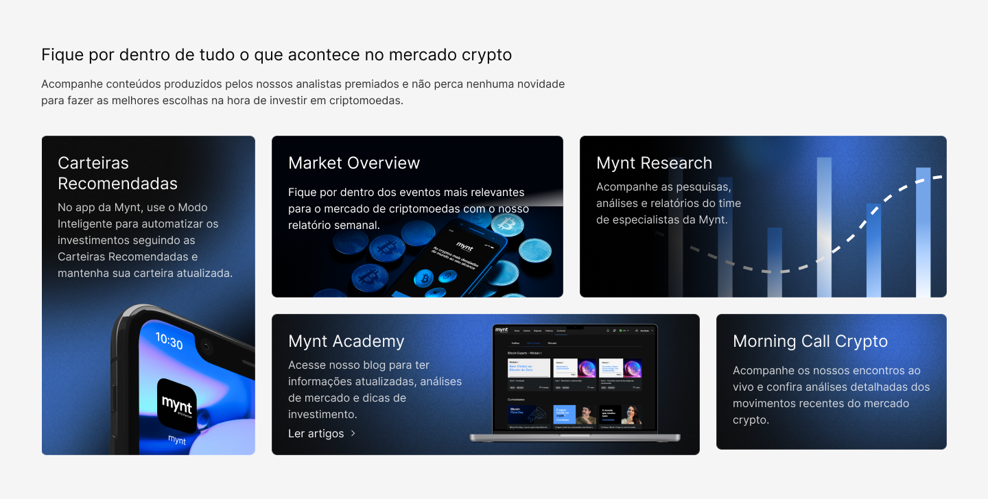
During the process, the possibility of implementing a dark mode was initially considered. However, this change would require a complete revision of the existing design tokens, as well as defining a theme-switching strategy. Given the systemic impact and the project scope, the decision was to keep the light version, ensuring consistency and short-term feasibility.
The new homepage design prioritized:
- Clear information hierarchy
- Accessible communication for beginner users
- Strategic use of animations and effects to guide attention
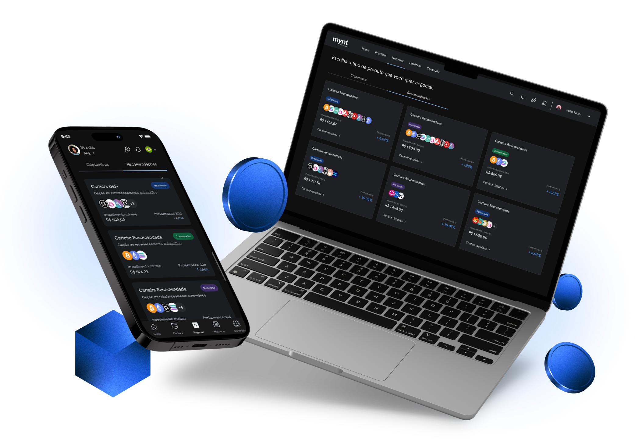
Animations were developed in partnership with the motion team, contributing to an experience closer to the app and reinforcing the brand’s modern character.
Results
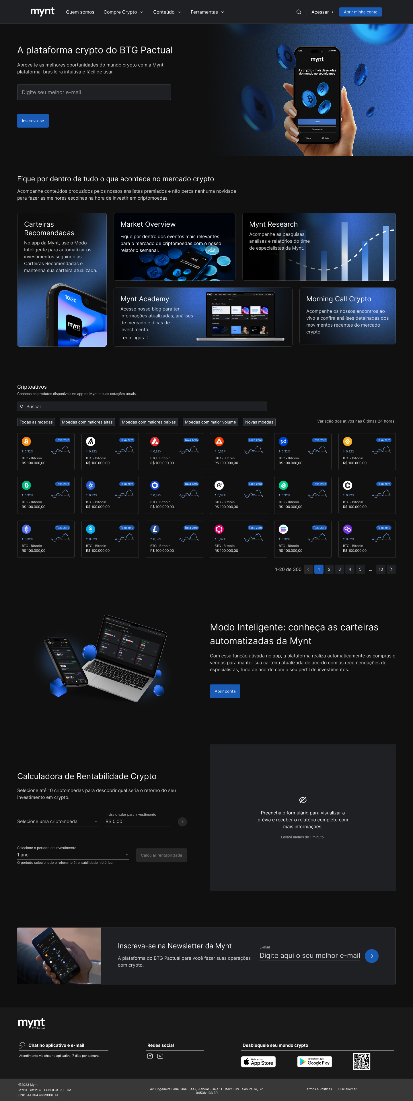
The initial delivery consisted of a new homepage in light mode, fully aligned with Mynt’s updated branding and structured to highlight priority features.
The result is a modern, organized page that is visually coherent with the brand’s identity, even before the definitive transition to dark mode.
The solution was designed to evolve easily. The standardization implemented now paves the way for a second phase in which dark mode can be introduced in a solid, responsive, and fully integrated way within the digital ecosystem.
The new homepage represents Mynt as it truly is: modern, vibrant, technological, and in motion. At the same time, it prepares the foundation for future expansions without rework or visual inconsistencies.
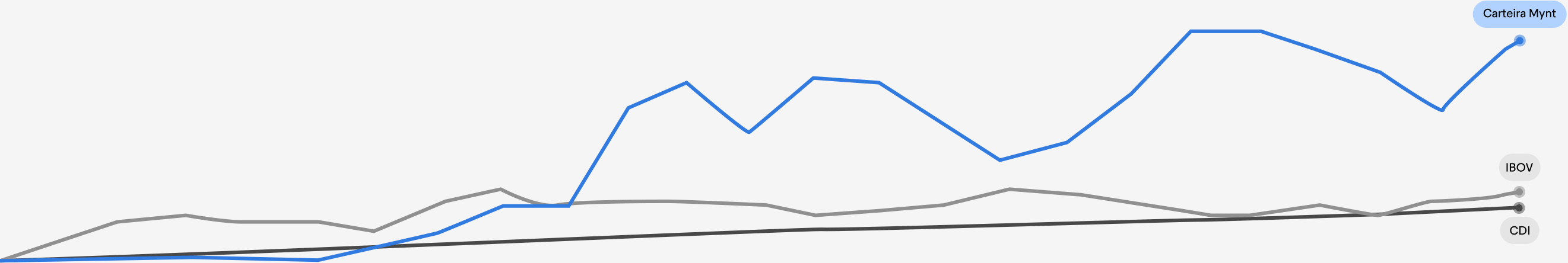
After the revamp was published, the main CTA on the page (“Open an account”) showed significant growth:
+259% increase in the number of users who reached the account opening page via the homepage, comparing the 30 days before and after launch.
This result indicates a meaningful improvement in value proposition clarity, information hierarchy, and overall experience effectiveness.

ABOUT
Mynt Homepage Revamp
Company: BTG Pactual Group
Launch: 2025
Role: UX/UI Designer
Collaborators: Business team, IT team, UX Research team, and Analytics team
Platform: Responsive Web
Overview
The Mynt homepage was outdated and no longer reflected the brand’s positioning or the experience offered in the app.
Although Mynt is a modern platform with strong use of motion and light, friendly communication in the app, its homepage failed to convey the same feeling, resulting in a disconnected experience between channels.
In addition, Mynt’s audience is mostly composed of beginners and people curious about the crypto universe, which reinforced the need for clearer, more fluid, and more intuitive communication from the very first interaction.
Process
Research
A benchmark was conducted with other players in the crypto market, identifying a pattern of more dynamic, modern, and motion-oriented pages.
The analysis highlighted a misalignment between Mynt’s digital experience in the app and its institutional page, reinforcing the need for a revamp focused on fluency and clarity.
UX Definitions & Decisions
During the process, the possibility of implementing a dark mode was initially considered. However, this change would require a complete revision of the existing design tokens, as well as defining a theme-switching strategy. Given the systemic impact and the project scope, the decision was to keep the light version, ensuring consistency and short-term feasibility.
The new homepage design prioritized:
- Clear information hierarchy
- Accessible communication for beginner users
- Strategic use of animations and effects to guide attention
Animations were developed in partnership with the motion team, contributing to an experience closer to the app and reinforcing the brand’s modern character.
Results
The initial delivery consisted of a new homepage in light mode, fully aligned with Mynt’s updated branding and structured to highlight priority features.
The result is a modern, organized page that is visually coherent with the brand’s identity, even before the definitive transition to dark mode.
The solution was designed to evolve easily. The standardization implemented now paves the way for a second phase in which dark mode can be introduced in a solid, responsive, and fully integrated way within the digital ecosystem.
The new homepage represents Mynt as it truly is: modern, vibrant, technological, and in motion. At the same time, it prepares the foundation for future expansions without rework or visual inconsistencies.
After the revamp was published, the main CTA on the page (“Open an account”) showed significant growth:
+259% increase in the number of users who reached the account opening page via the homepage, comparing the 30 days before and after launch.
This result indicates a meaningful improvement in value proposition clarity, information hierarchy, and overall experience effectiveness.